Webサイトやブログなどで必ずある見出し。
「CSSだけで見出しをおしゃれにしたいけれど、どのように作ればよいかわからない」
そのように悩まれている方も多いでしょう。
見出しのデザイン一つでWebサイトやブログの印象は大きく変わります。
そこで、今回はCSSだけで作ることができる、2023年最新版おしゃれな見出しデザイン20選をトレンド解説とともに紹介します。また、コピペで使えるHTML・CSSのサンプルコード、Wordpressとはてなブログでの使い方も紹介しているので、ぜひ参考にしてみてくださいね。
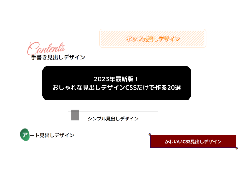
CSSのみで作る見出しデザイン
WEB(HTML)上で、見出しとして使用されるタグはhタグ(h1~h6)です。そのため、サンプルのHTMLではh2を例にして作成してますが、使用したい箇所にclass属性を追加するなどして、見出し以外のデザインにも反映することも可能です。
おしゃれな見出しデザイン
- シンプル系
- ポップ系
- かわいい系
- スタイリッシュ系
- 手書き系
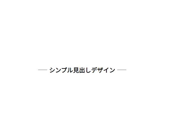
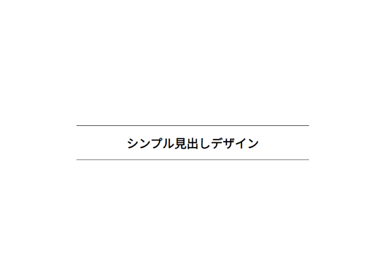
シンプル系
無駄なものを省き、必要最小限のものだけでシンプルに表現をする「ミニマリズム」を意識したデザインもトレンドの一つです。
また、配色トレンドの一つにモノクロ調もあり、白と黒で表現することで、カラフルなWebサイトが多い中で、強い印象も与えられそうです。
さらに、使い勝手もよく、シンプルで洗練された雰囲気もあっておしゃれですね。
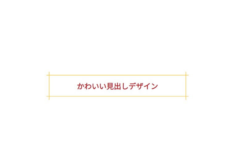
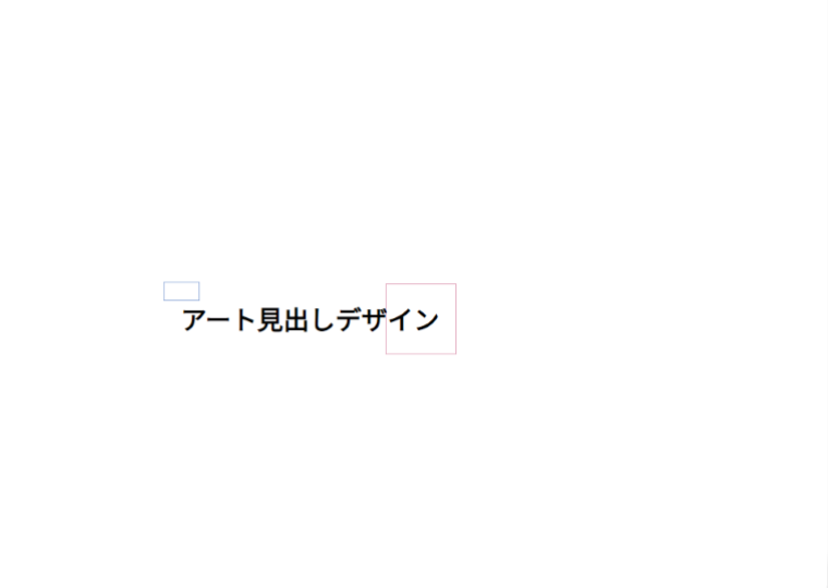
両端にライン
h2 {
position: relative;
display: inline-block;
padding: 0 55px;
}
h2:before, h2:after {
content: ”;
position: absolute;
top: 50%;
display: inline-block;
width: 45px;
height: 1px;
background-color: black;
}
h2:before {
left:0;
}
h2:after {
right: 0;
}
上下にライン
h2 {
position: relative;
text-align: center;
border-top: solid 1px;
border-bottom: solid 1px;
}
上下に四角のライン
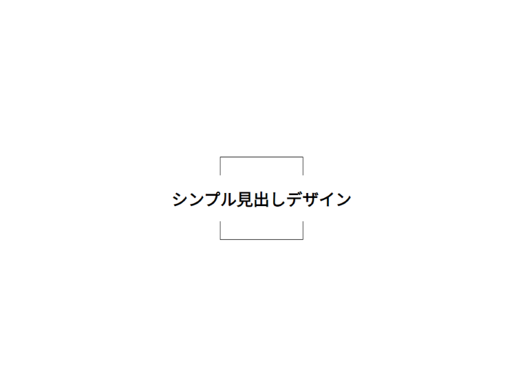
h2 {
position: relative;
text-align: center;
background-color: #fff;
}
h2:before {
content: ”;
height: 150px;
width: 150px;
border: solid 1px #000;
display: block;
position: absolute;
left: 0;
right: 0;
top: 0;
bottom: 0;
margin: auto;
z-index: -1;
}
h2-wrap {
padding-bottom: 20px;
}
背景に文字と下にライン
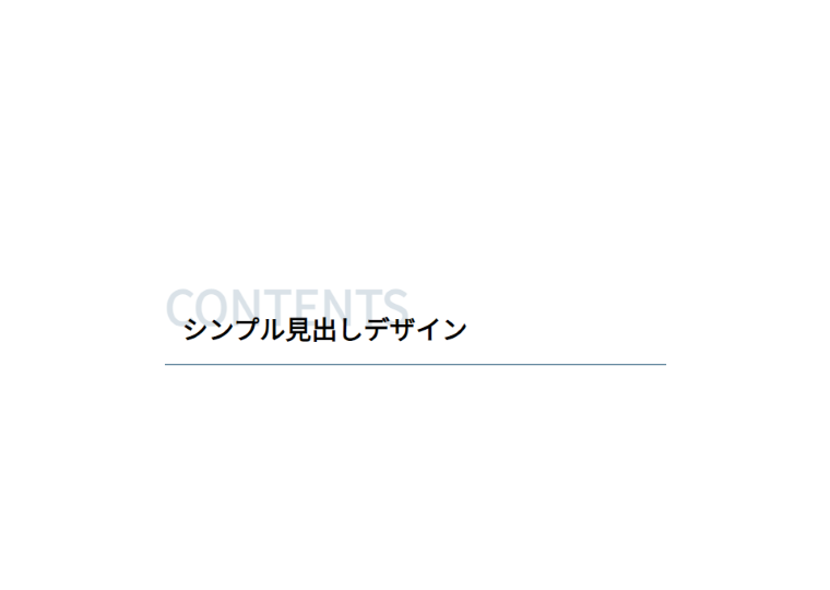
h2 {
position: relative;
padding-top: 45px;
border-bottom: 1px solid rgba(5,62,98,1);
}
h2::before {
content: “Contents”;
position: absolute;
top: 0px;
left: 0px;
color: rgba(5,62,98,0.15);
font-size: 55px;
text-transform: uppercase;
z-index: -1;
}
上下のラインと付箋風アイコン
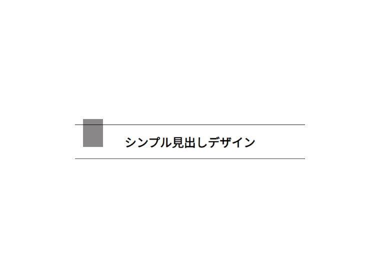
h2{
display: flex;
flex-direction: column;
align-items: center;
justify-content: center;
position: relative;
border-top: solid 1px black;
border-bottom: solid 1px black;
}
h2::before{
content: “”;
position: absolute;
top: -15px;
left: 20px;
width: 50px;
height: 70px;
background-color: #898787;
z-index: -1;
}
ポップ系
自粛ムードも明け、ちょっとした面白さや楽しさ、陽気な雰囲気をデザインに取り入れることもトレンドとなってます。
また、配色トレンドの中では、グラデーションカラーと鮮やかな蛍光色とがあり、この色合いを取り入れることでより明るいユニークな印象になりそうです。
明るいカラーがアクセントになっていたり、ストライプやボーダーでカジュアルな印象のデザインもポップでかわいいですね。
囲み斜めストライプ
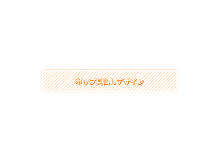
h2 {
position: relative;
border-radius: 5px;
outline: 2px solid #ffe5cc;
outline-offset: 8px;
background: repeating-linear-gradient(-45deg, #ffe5cc 0 3px, #fff 5px 10px);
color: #fff;
text-shadow: -1px -1px 0 #ff7b00, -1px 1px 0 #ff7b00, 1px -1px 0 #ff7b00, 3px 3px 0 #ff7b00;
font-weight: bold;
text-align: center;
}
背景にグラデーション
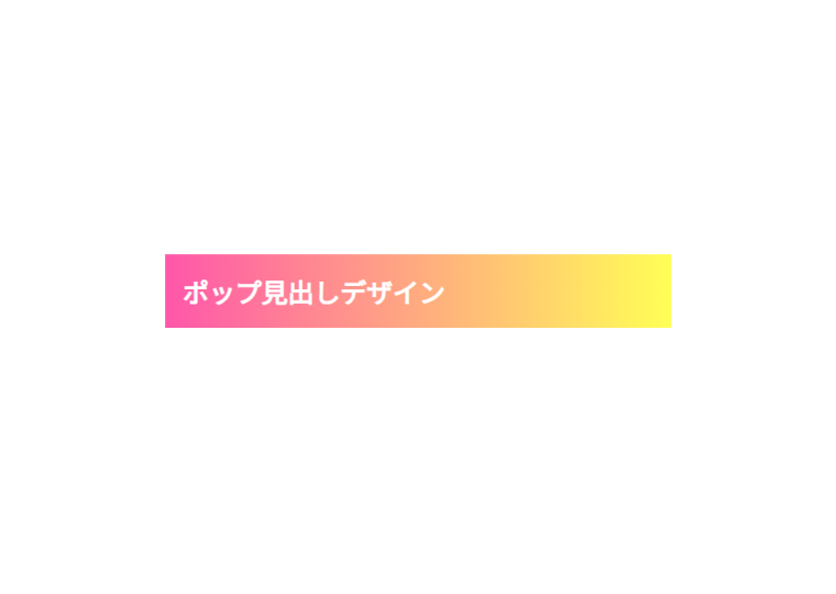
h2 {
background: linear-gradient(to right, rgb(255, 86, 170), rgb(255, 255, 86));
background-repeat: no-repeat;
color: white;
font-weight: bold;
}
背景にグラデーションと囲み線
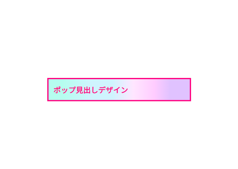
h2 {
border: 5px solid;
background-image: linear-gradient(89.9deg, rgba(178, 253, 238, 0.96) 10%, rgba(207, 244, 254, 1) 30%, rgba(207, 244, 254, 1) 45%, rgba(255, 230, 255, 1) 60%, rgba(255, 204, 255, 1) 75%, rgba(219, 183, 255, 0.85)86%);
color: #ff007f;
font-weight: bold;
}
背景に色と文字に影
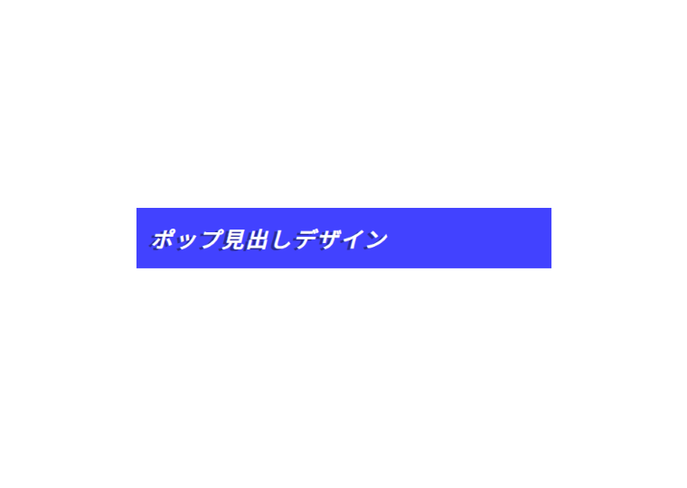
h2 {
font-style: italic;
letter-spacing: .1em;
color: #fff;
background: #4242ff;
text-shadow: -5px 2px 0 #282899;
}
タグ風背景
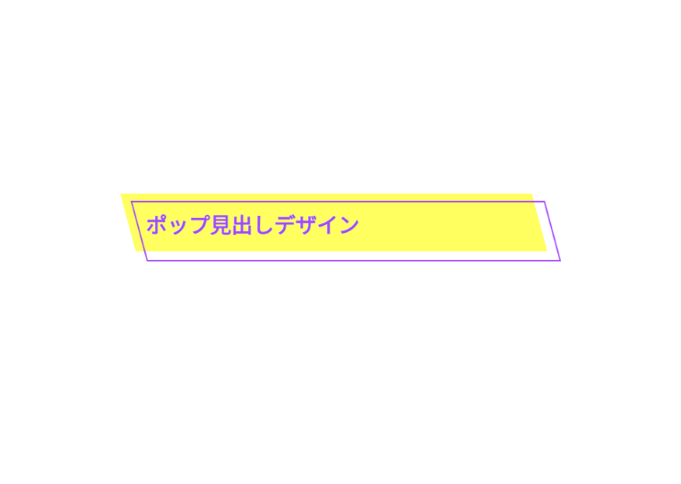
h2 {
position: relative;
padding: 15px;
color: #a347ff;
font-weight: bold;
}
h2::before,
h2::after {
position: absolute;
width: 100%;
height: 110%;
content: ”;
z-index: -1;
transform: skew(15deg);
}
h2::before {
top: -5px;
left: -10px;
background-color: #ffff60;
}
h2::after {
top: 5px;
left: 5px;
border: 2px solid;
}
かわいい系
1980~1990年代をイメージされるレトロなデザインと今のトレンドを組み合わせた、「レトロモダン」もトレンドのデザインの一つです。
無機質な質感でありながら、どこか温かみのあるノスタルジックなデザインスタイルがかわいいですね。
ステッチ風
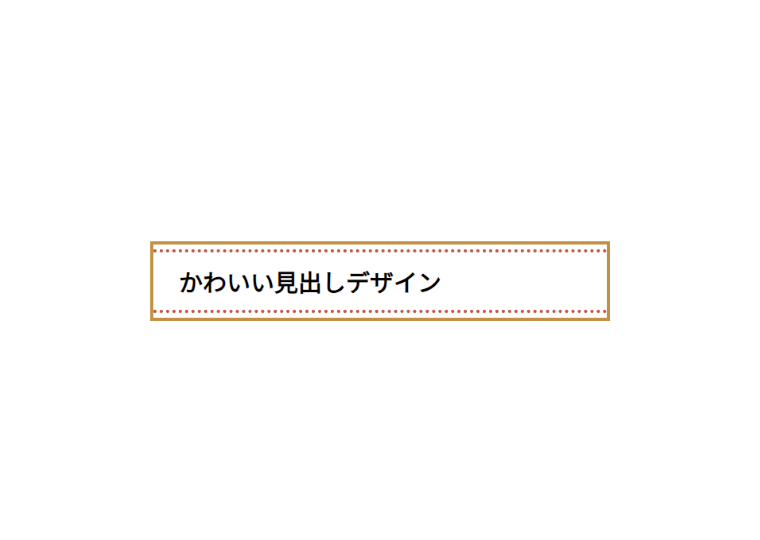
h2 {
position: relative;
padding: 1.5rem 2rem;
border: 4px solid #000;
border-color: #c39143;
}
h2:before,
h2:after {
position: absolute;
left: 0;
width: 100%;
content: ”;
border-top: 4px dotted #000;
border-color:#c25742;
}
h2:before {
top: 6px;
}
h2:after {
bottom: 6px;
}
囲み線
h2 {
position: relative;
text-align: center;
border-top: 2px solid #fbca4d;
border-bottom: 2px solid #fbca4d;
color: #b7282e;
}
h2:before,h2:after{
content: ”;
position: absolute;
top: -15px;
width: 2px;
height: calc(100% + 1em);
background-color: #fbca4d;
}
h2:before {
left: 10px;
}
h2:after {
right: 10px;
}
ストライプの下線
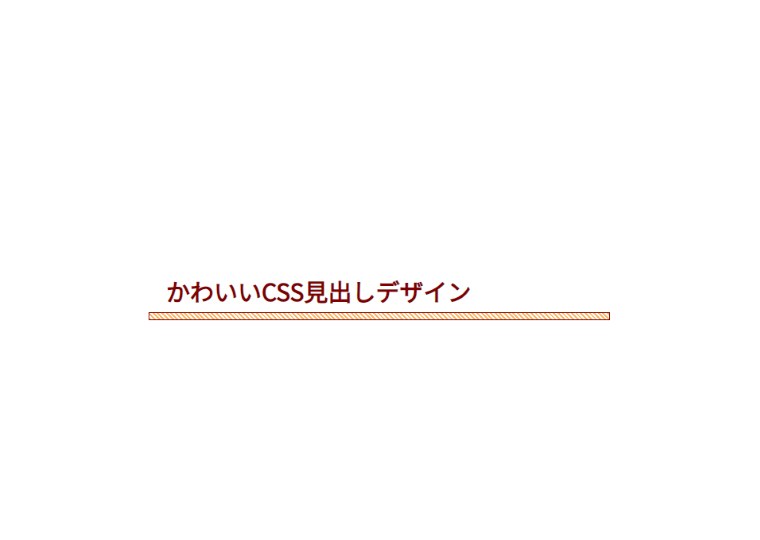
h2 {
position: relative;
color: #800000;
font-weight: bold;
}
h2::before {
position: absolute;
height: 0.5rem;
width: 100%;
bottom: 5px;
right: 0;
border: 1px solid #800000;;
background: repeating-linear-gradient(45deg, #f8b862 0 2px, transparent 2px 4px);
content: ”;
}
背景にドット
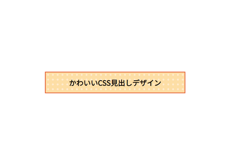
h2 {
position: relative;
outline: 3px solid #e45e32;
background-image:
radial-gradient(#ffebcd 30%, transparent 30%),
linear-gradient(#fddea5 0 100%);
background-repeat: repeat, no-repeat;
background-size: 20px 20px, 100% 100%;
font-weight: bold;
text-align: center;
}
囲み線の角に丸
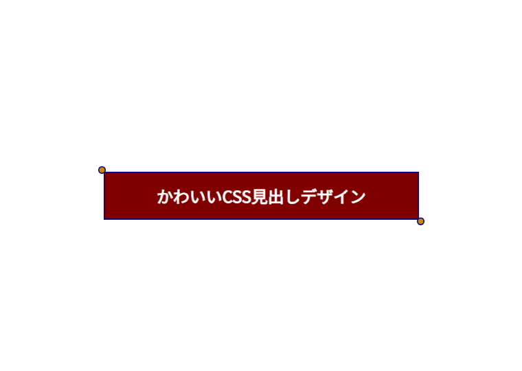
h2 {
color: #fff;
position: relative;
text-align: center;
border: solid 2px #000080;
border-radius: 3px 0 3px 0;
background: #800000;
}
h2:before, h2:after {
content: ”;
position: absolute;
width:10px;
height: 10px;
border: solid 2px #000080;
border-radius: 50%;
background: #cc8800;
}
h2:after {
top:-12px;
left:-12px;
}
h2:before {
bottom:-12px;
right:-12px;
}
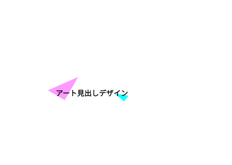
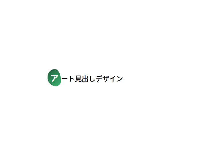
アート系
図形や幾何学柄、色で表現する抽象画のようなデザインもトレンドになってます。
四角や三角など様々な形を組み合わせたり、カラーで遊んだりするのもおしゃれですね。
四角を組み合わせる
h2 {
position: relative;
text-align: center;
display: inline-block;
}
h2:before {
content: ”;
height: 20px;
width: 40px;
border: solid 1px #ccc;
border-color: #94adda;
display: block;
position: absolute;
left: 0;
top: 0;
margin: auto;
z-index: -1;
}
h2:after {
content: ”;
height: 80px;
width: 80px;
border: solid 1px #ccc;
border-color: #e3adc1;
display: block;
position: absolute;
right: 0;
bottom: 0;
margin: auto;
z-index: -1;
}
h2-wrap {
padding-bottom: 20px;
text-align: center;
}
三角を組み合わせる
h2 {
position: relative;
margin-bottom: 15px;
padding-top: 50px;
padding-left: 40px;
}
h2:before {
content: ”;
width: 0;
height: 0;
border-style: solid;
border-width: 0px 0 110px 80px;
border-color: transparent transparent #ff99ff transparent;
position: absolute;
z-index: -1;
transform: rotate(30deg);
top: -20px;
left: 30px;
}
h2:after {
content: ”;
width: 0;
height: 80px;
border-style: solid;
border-width: 80px 0 30px 50px;
border-color: transparent transparent #14ffff transparent;
position: absolute;
z-index: -1;
transform: rotate(40deg);
bottom: 0;
margin: auto;
}
いびつな丸を作る
h2 {
font-weight: bold;
}
h2::first-letter {
padding: 0.7rem;
border-radius: 54% 46% 38% 62%/49% 70% 30% 52%;
background-color: #2d1b11;
background-image: linear-gradient(135deg, #236641 10%, #3cb371 100%);
color: white;
font-size: 36px;
}
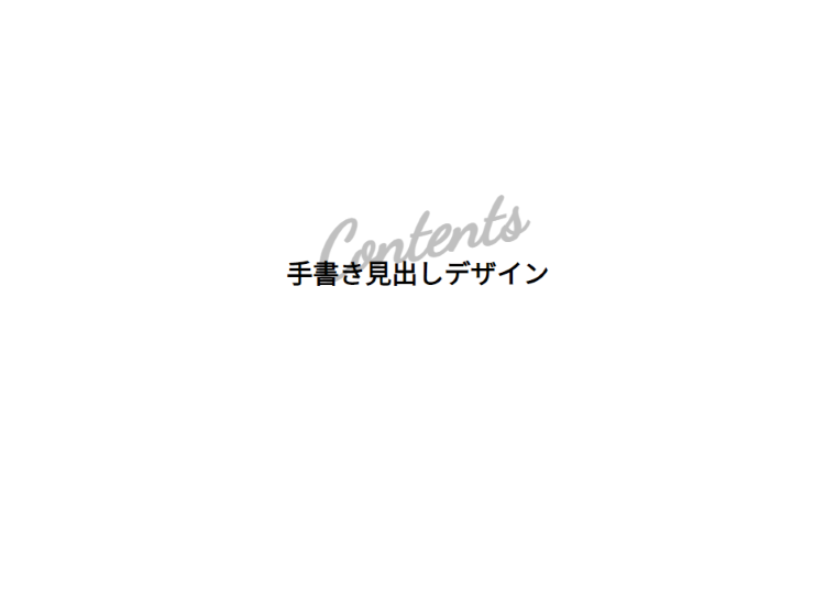
手書き系
あえて文字だけで、フォントやカラーで個性を出す、デザイン性の高いレイアウトもトレンドとして注目を集めています。
手書き風な文字もインパクトがあり、おしゃれですね。
中心に影のような英字
h2 {
text-align: center;
position: relative;
}
h2::before {
content:”Contents”;
position: absolute;
top: -50px;
left: 50%;
transform: translateX(-50%) rotate(-12deg);
color: #c0c0c0;
font-size: 80px;
font-family: ‘Dancing Script’, cursive;
font-style: italic;
z-index: -1;
}
エレガントな英字
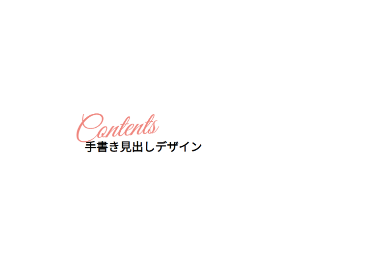
h2 {
position: relative;
padding-top: 50px;
padding-left: 30px;
}
h2::before {
content: “Contents”;
position: absolute;
transform: rotate(-5deg);
top: -20px;
left: 0;
color: #ef857d;
font-size: 80px;
font-weight: 400;
font-family: ‘Great Vibes’, cursive;
font-style: italic;
}
WordPressとはてなブログでの使い方
ここまで、デザインサンプルやHTML・CSSコードを紹介してきましたが、それをWebサイトやブログ作成でよく使われている、Wordpressとはてなブログではどのように反映していくかの手順を解説していきます。
WordPress
- CSSコードをコピペ
- HTMLコードをコピペ
使いたいデザインのCSSコードをコピーして、ワードプレスのCSSファイル(Style.css)に貼り付けます。最初からコードが記載されておりますが、それは消さないように注意してください。
次に、使いたいデザインのHTMLコードをコピーして、記事の中で見出しデザインを挿入したい箇所に貼り付けます。ここでは、HTMLで編集ができるモードに切り替えた後に貼り付けるよう注意しましょう。
はてなブログ
- CSSコードをコピペ
使いたいデザインのCSSコードをコピーして、はてなブログのデザインCSSに貼り付けます。CSSを書き終えたら変更を保存するをクリックして完了です。
しかし、はてなブログのテーマデザインに依存している見出しデザインがある場合、CSSコードのデザインが反映されない場合がありますので、注意が必要です。
まとめ
以上、CSSだけで作るおしゃれな見出しデザインをサンプルコードとともにご紹介しましたが、いかがでしょうか。
また、Webサイトやブログ作成でよく使われている、Wordpressとはてなブログでの使い方も合わせて解説しました。
そして、よりデザインに興味を持った方は、下記の記事でWEBデザインのトレンドも解説されてますので、ご覧ください。
https://japan-design.jp/design/0014/#index_id1
文字や色味、ラインの太さを少し変えるだけでも、がらりと印象が変わります。お好みでカスタマイズをしながら、素敵な見出しを作ってみてください。

講師と1対1で学べる資格・PCスキル講座のソフトキャンパス!
リスキリングでお得に資格取得を目指すならマンツーマンレッスン!
分からないところだけをちょっとだけ聞きたい、そんなあなたに!


![[2023年最新版] おしゃれなおすすめ CSSワークフレーム特集](https://onepoint.softcampus.co.jp/wp-content/uploads/2024/01/image2-150x150.jpg)